top of page

Floraux brands itself as a patisserie which
integrates floral flavours and aesthetics into its identity. The brand name, derived from “floral” in French, embodies the essence of the brand, which is sophisticated and delicate
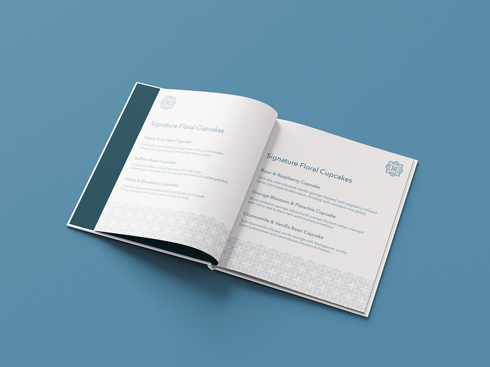
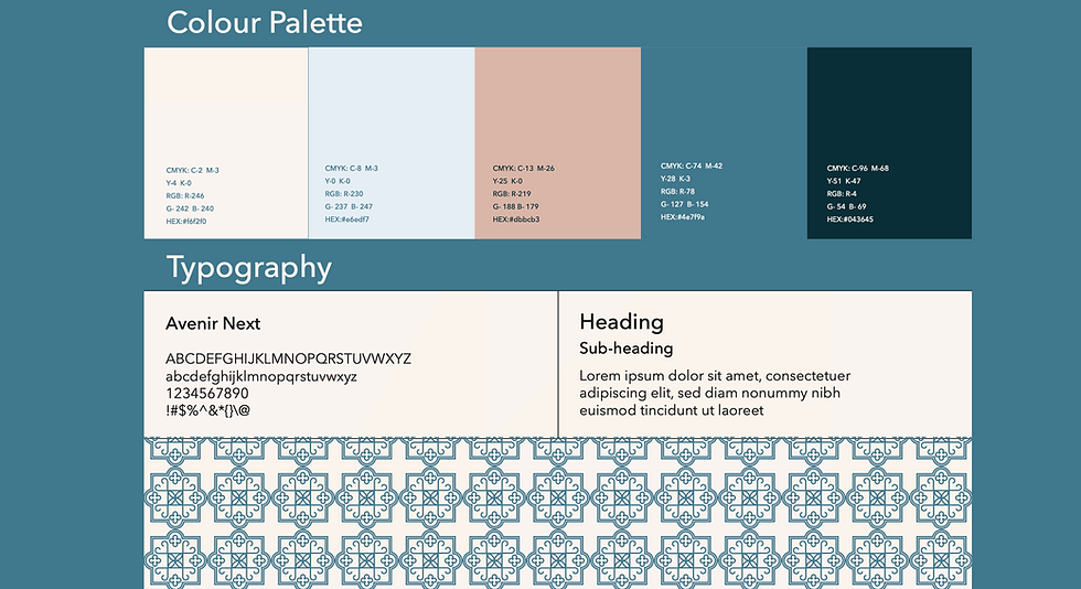
Floraux takes a modern, minimalist approach, using a blue-and-white colour palette inspired by classic French porcelain and fine china.


This visual identity allows the brand to stand out while maintaining a
timeless and luxurious feel.
The colour blue is used to convey luxury,
serenity, and refinement, while white is used to represent purity
and simplicity, reinforcing the brand’s clean and high-end appeal.



bottom of page